
MVOG Studio MVOG Studio MVOG Studio MVOG Studio
  • Home
  • About
  • Projects
  • Services
  • Contact
Takamo Universe science fiction brand identity and logo design by MVOG Studio

Takamo Universe. Science Fiction Brand Identity.
Branding / Illustrations / Logo
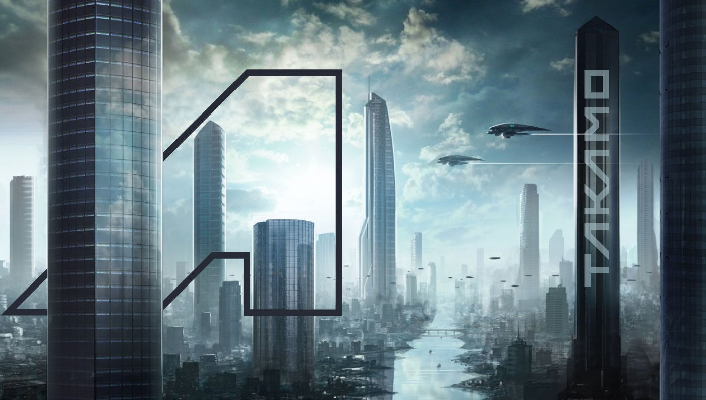
Takamo Universe science fiction brand identity. Futuristic city skyline with spacecraft and custom logo mark by MVOG Studio.

The Legacy

Takamo Universe is a science fiction publishing imprint with origins going back to 1981, when editor-in-chief Randall Ritnour and his college friends built a play-by-mail strategy game on IBM’s earliest PCs. They started as a small community of players, but grew in shape and form over four decades, into thousands of pages of lore, a stable of contributing authors, and a series of novels co-developed with Kevin J. Anderson, the bestselling author known for his work on the Dune universe.
By the time we came on board, Takamo had an archive of stories, characters, and interstellar conflicts spanning 400,000 years of fictional history. But no brand to carry it into a global marketplace where it could be discovered. A template website and a game-era logo were doing none of its heritage any justice.
The vision was to build Takamo into a scalable science fiction imprint, a professional publishing brand capable of attracting authors and audiences around the world, with long-term aspirations toward multimedia expansion, community-driven storytelling, and a franchise footprint not unlike Star Wars or the Marvel Cinematic Universe.

The Challenge

The scale of the lore was both the project’s greatest asset and its most demanding challenge. Designing for Takamo meant designing for a universe with decades of accumulated material, multiple active genres and sub-genres, a diverse author base, and ambitions that extended well beyond books.

There were several tensions that we needed to tackle in our approach:

Classic vs. contemporary. Takamo’s very DNA was made in the classic space opera era of the 70s and 80s. But they needed to connect audiences and touchpoints in the present, which meant digital marketplaces, Discord communities, gaming-adjacent platforms, and more. We wanted the identity to honor the heritage but needed to prepare for the future.

Signature vs. flexible. A brand with multiple sub-genres (military hard sci-fi, sci-fi romance, absurdist humor, character-driven drama), multiple product formats, and an open-contribution author model needed a visual system that could hold its shape across wildly different contexts. It was important to have a single strong mark that could anchor a system but also flex without disconnecting across its ecosystem.

Epic vs. universal. Much of the existing visual material leaned into the heavy, mechanical, militaristic imagery that the lore naturally contained, but the author base and readership were significantly diverse. Many of Takamo’s strongest stories were character-driven, humorous, romantic. The visual identity had to carry the epic weight of the universe while staying genuinely open to a wide variety of authors and audiences and themes.

On top of all of this: an existing archive of thousands of creative assets — artwork, illustrations, character sketches, spacescapes — with no cataloguing system, no tagging, no way to efficiently locate and deploy the right imagery at the right moment for marketing channels and campaign assets.
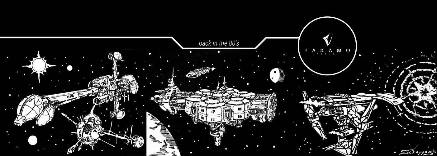
Takamo Universe original 1980s science fiction illustrations and old logo before rebranding by MVOG Studio.
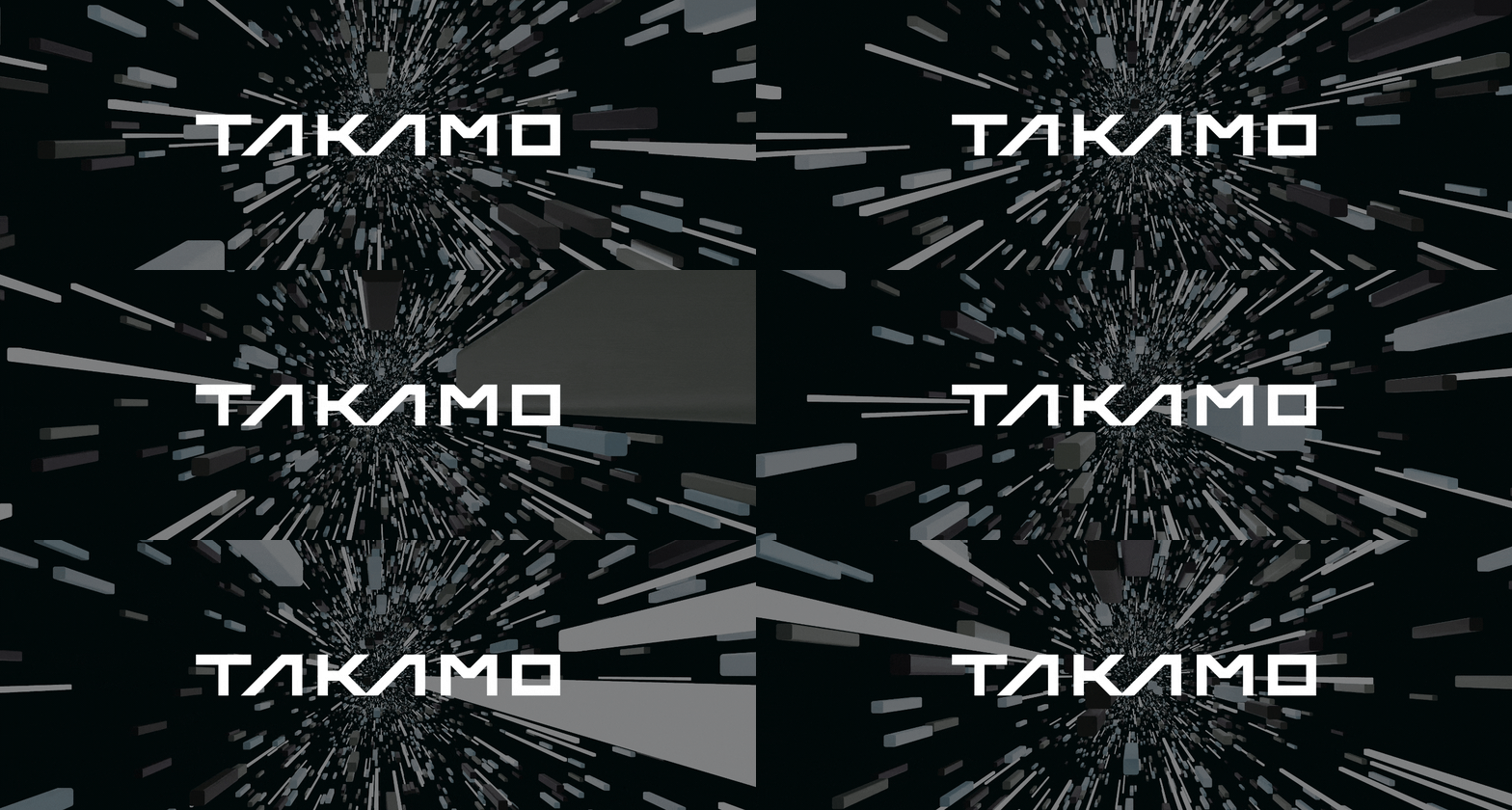
Takamo Universe animated logo design. Custom sci-fi typography in motion by MVOG Studio.
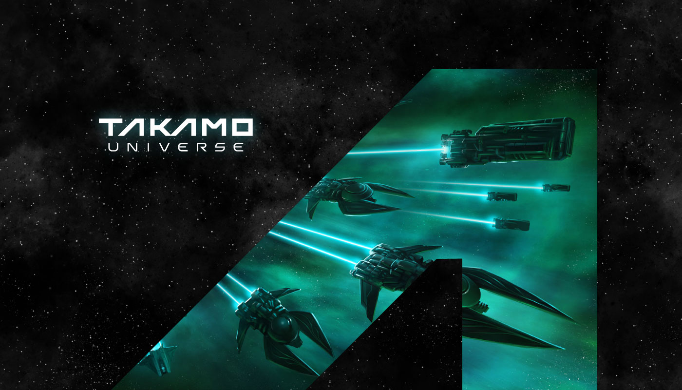
Takamo Universe logo and favicon design alongside science fiction spacecraft visuals. Brand identity by MVOG Studio.
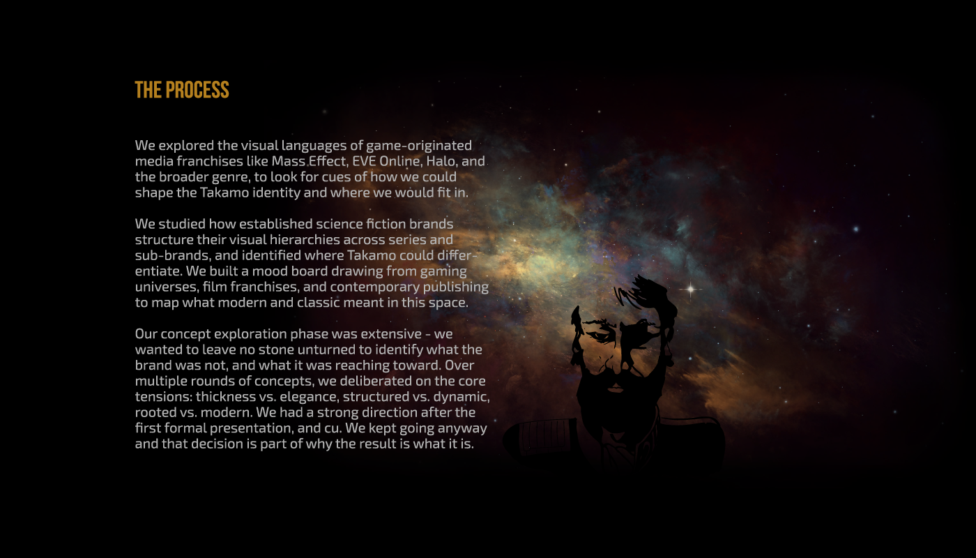
Takamo Universe branding process and strategy. Brand identity built on lore, Gestalt principles and exact geometry by MVOG Studio.
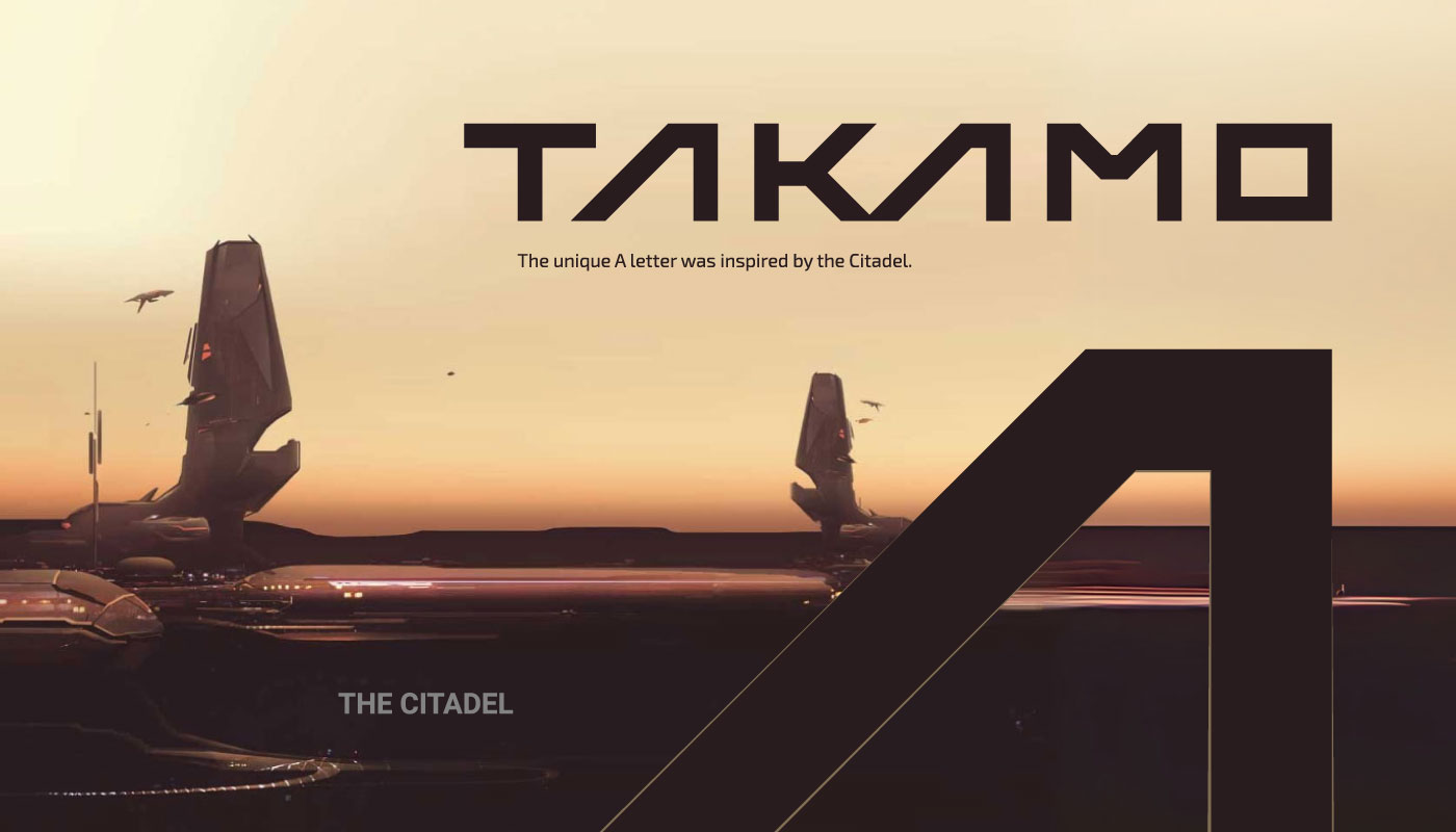
Takamo Universe custom logo typography. The letter A inspired by the Citadel structure in the science fiction universe. Logo design by MVOG Studio.

“The angled structure and connectedness of the symbol encapsulate the past, present, and future, the whole and the part, the oblivious and the sentient, the inward and the beyond, the known and the unknown. Takamo is the ancient language of space.”

The logomark draws from architectural forms within the Takamo universe and from the concept of Gestalt, a recurring philosophical idea in the canon, describing how interconnected systems form a greater whole. Structurally, the linear pattern connects the K and A at the center of the mark – a small way to echo a core belief in the Takamo Universe – that every event, every character, every story is connected to something larger. The angled A captures a sense of dynamic movement. The logomark reads as ancient and futuristic at once, stable enough to anchor the system, distinctive enough to hold attention.
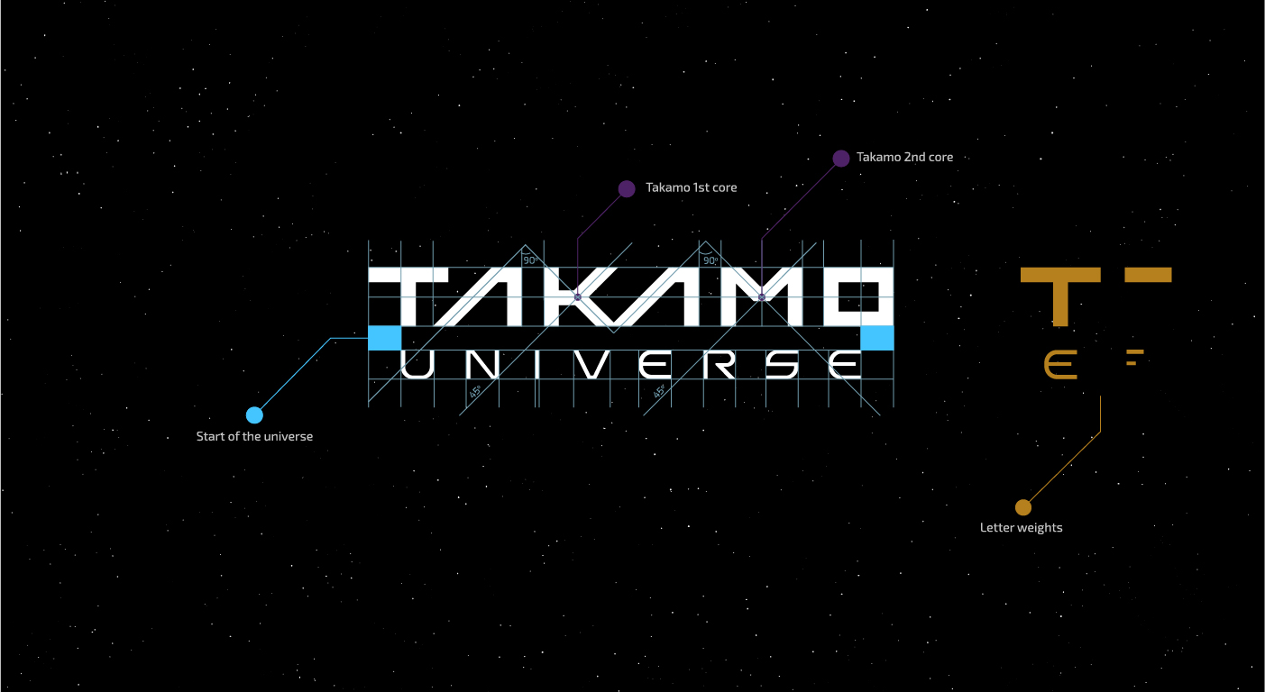
Takamo Universe logo grid system and typography construction. Custom letterform geometry and letter weights designed by MVOG Studio.
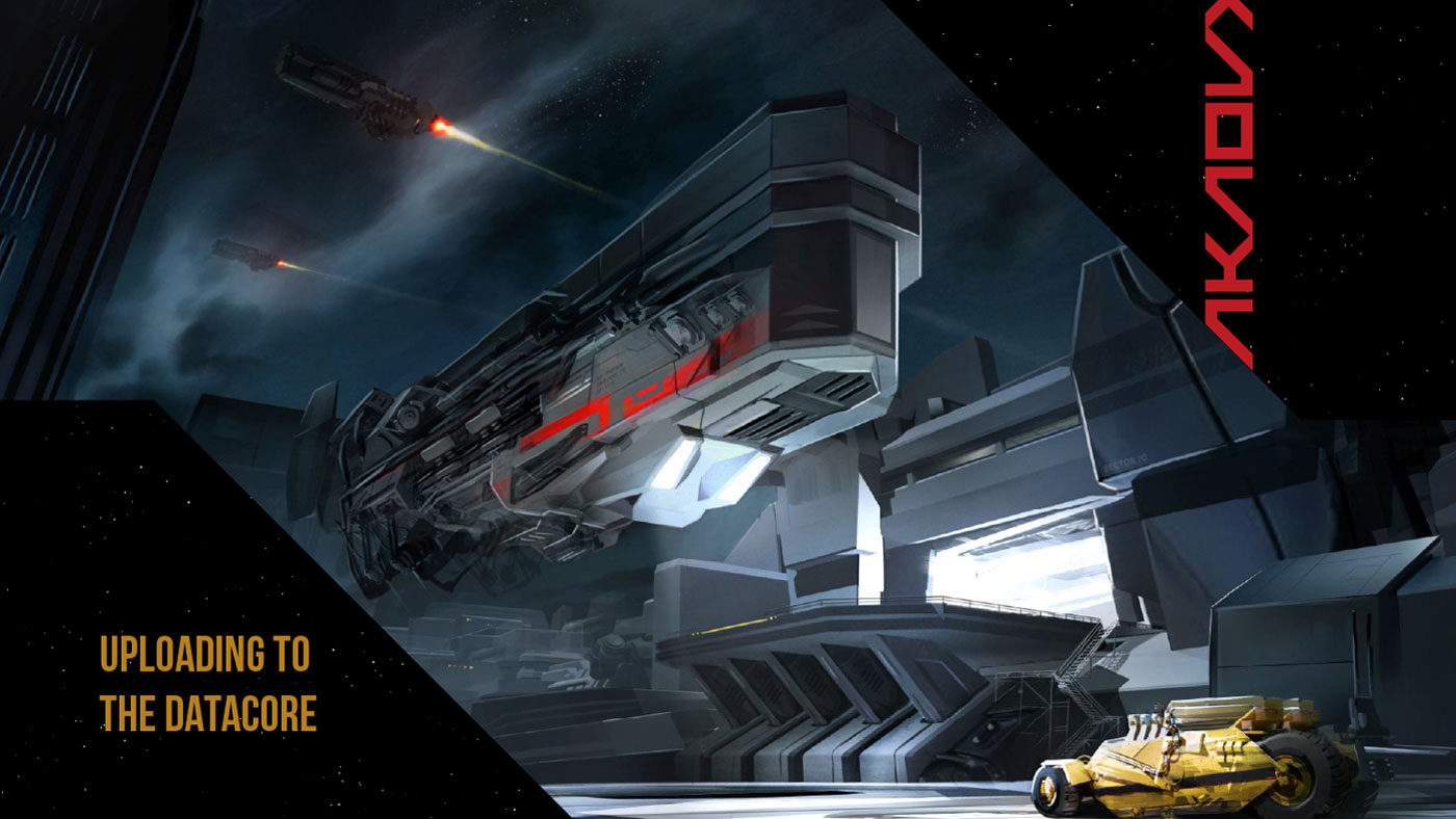
Takamo Universe Illustration visual identity. Science fiction space station scene with custom faction logo and brand typography by MVOG Studio.


The new logo design and identity system beautifully blended in with Takamo lore.
Everything is now in place, the new era of this epic adventure begins…

A full typography hierarchy, iconography, patterns, modular graphic elements, image treatment guidelines, and cover art, all designed to give Takamo’s community of authors, designers, and collaborators the tools to work within the identity without diluting it.
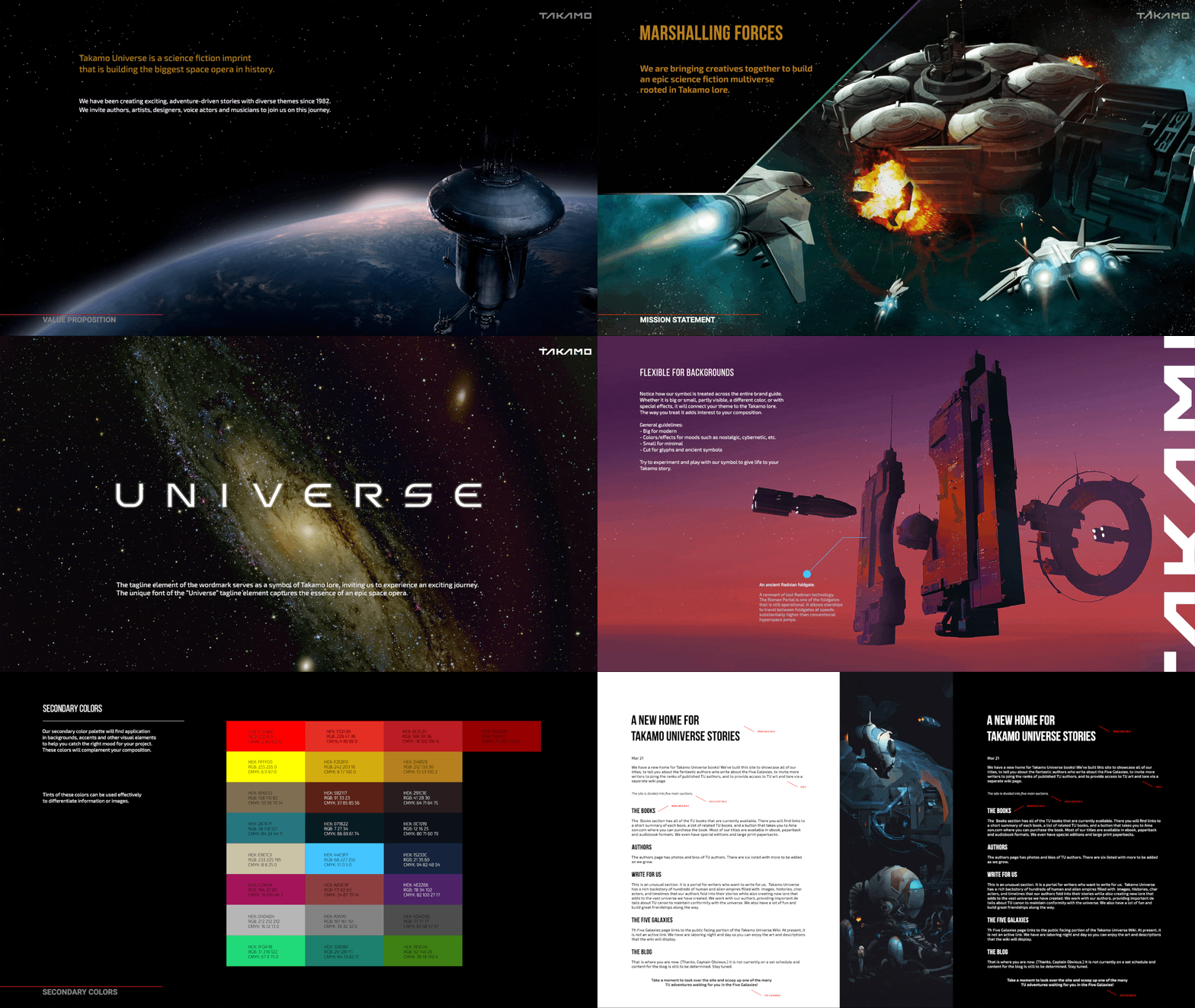
Takamo Universe brand guidelines document selective slides. A manual covering logo, typography, colour, patterns and usage rules designed by MVOG Studio.
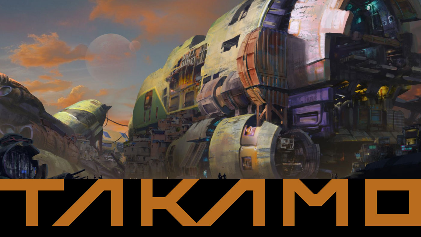
Takamo Universe faction logo in orange colour variation against alien planet landscape. Brand identity colour system by MVOG Studio.
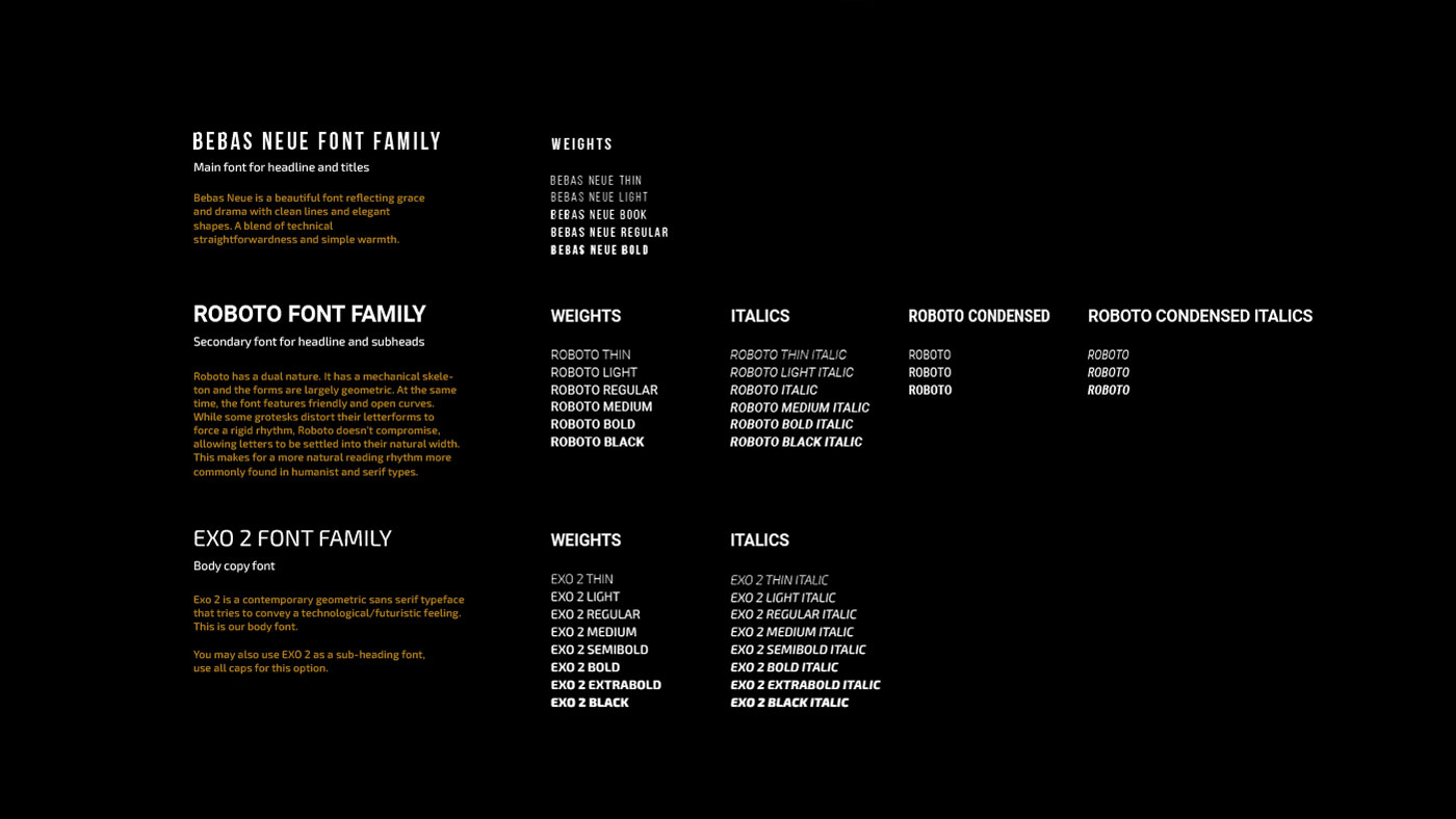
Takamo Universe typography system and font usage guidelines. Custom typeface and supporting fonts defined within the brand guidelines by MVOG Studio.
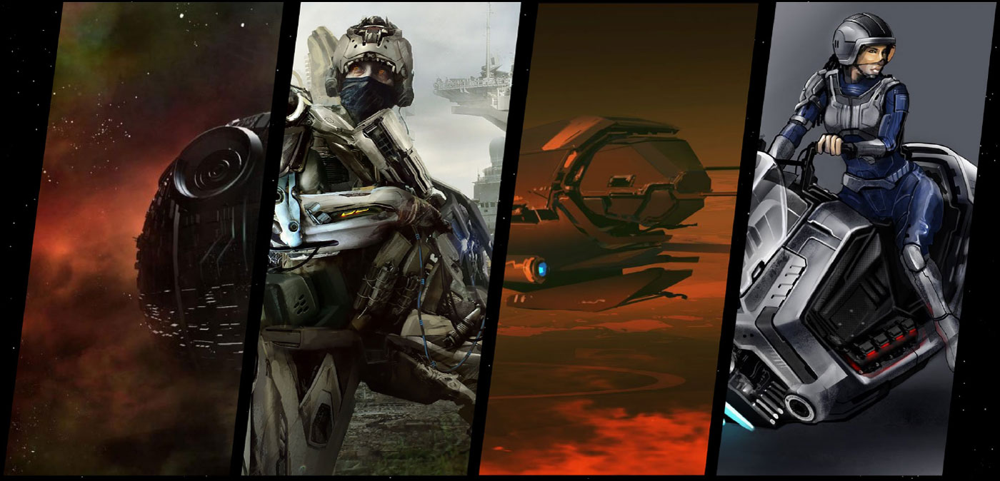
Takamo Universe world building visuals. Science fiction characters, spacecraft and environments developed as part of the brand identity system by MVOG Studio.
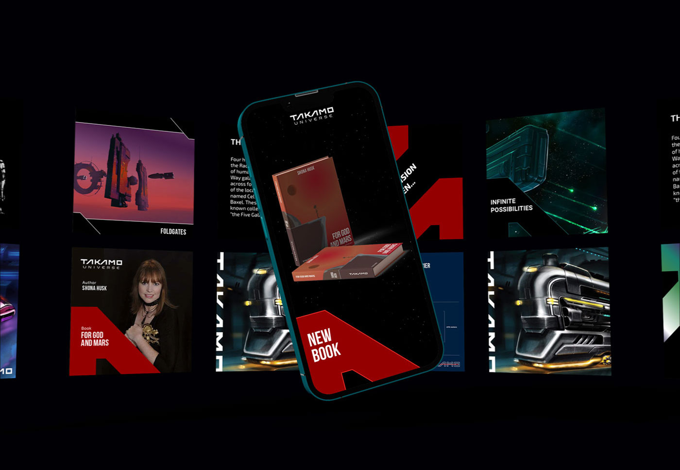
Takamo Universe social media templates and mobile brand identity. Custom post designs for book launches, game updates and universe content by MVOG Studio.
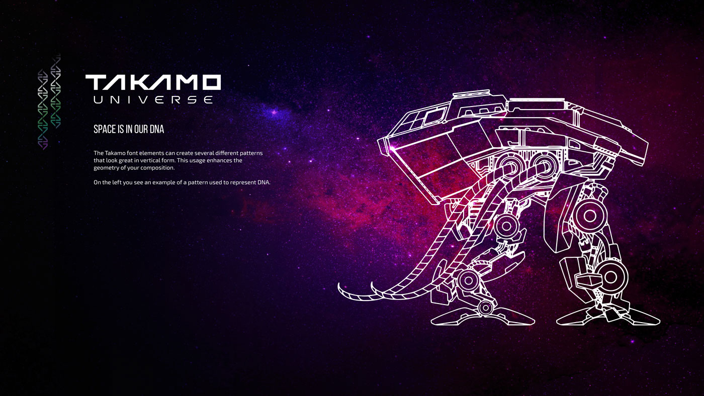
Takamo Universe brand guidelines showing custom typography pattern used as DNA visual element. Brand identity system by MVOG Studio.
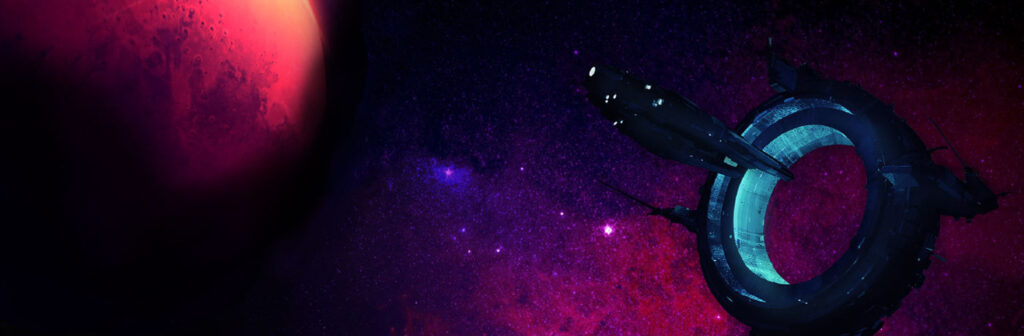
Takamo Universe science fiction space station and planet key visual. Brand identity atmospheric imagery by MVOG Studio.
Takamo Universe website banner showing futuristic city, combat character and spacecraft. Brand identity applied to web design by MVOG Studio.
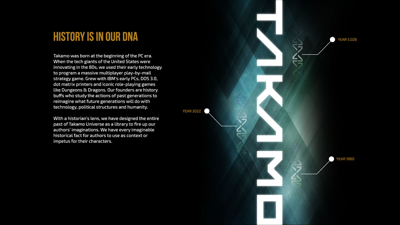
Takamo Universe website design showing brand history timeline from 1980 to 2022. Custom typography pattern and brand storytelling by MVOG Studio.
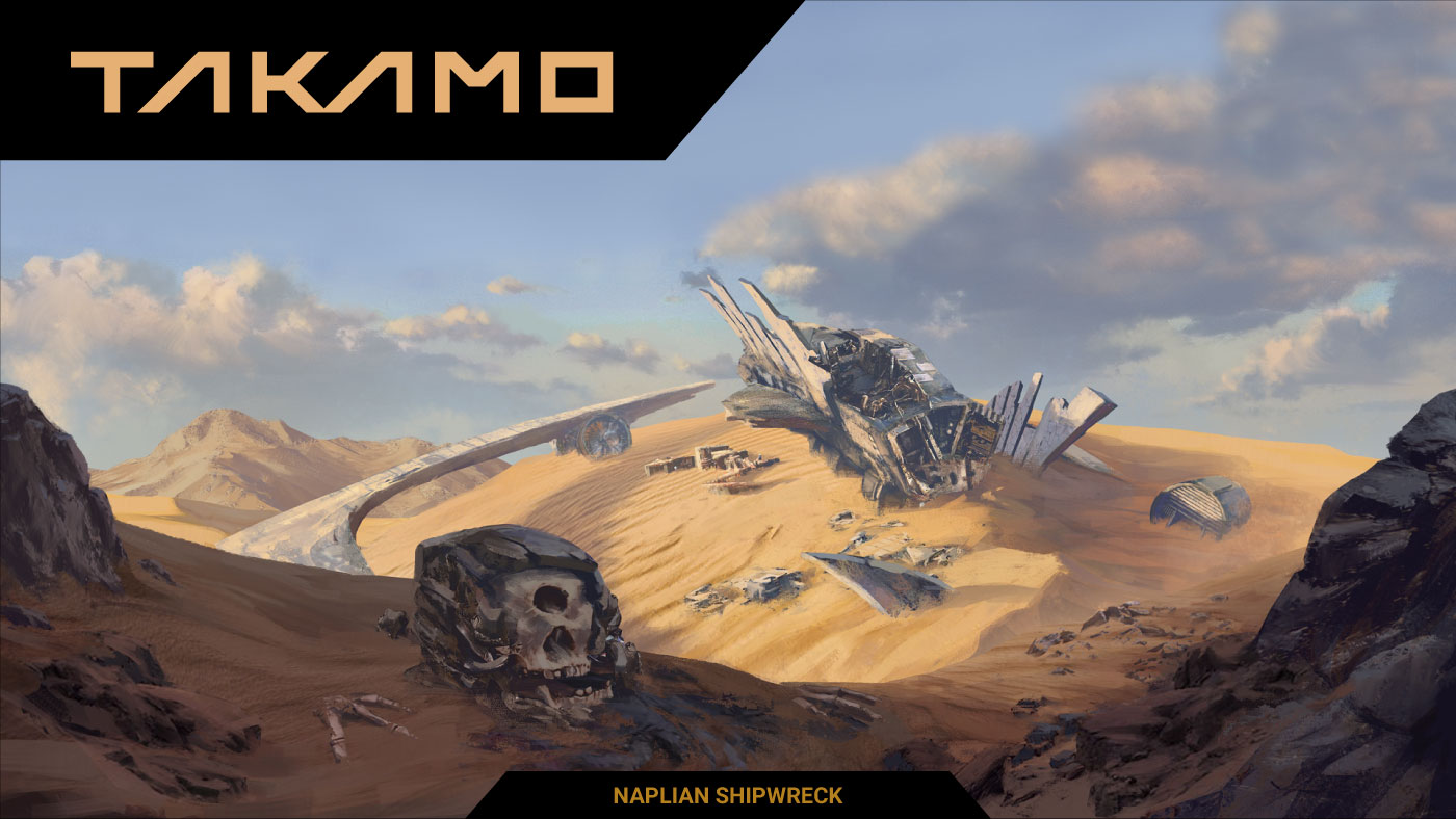
Takamo Universe Naplian Shipwreck scene on a desert planet. Science fiction brand visual with custom logo mark by MVOG Studio.
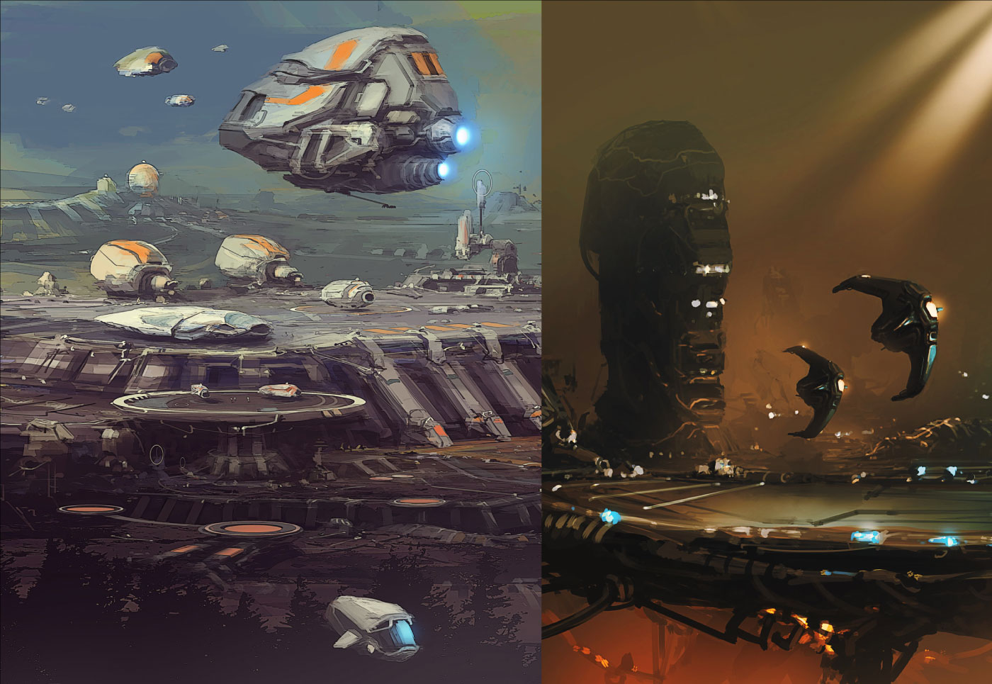
Takamo Universe faction spacecraft and alien planet surface environments. Science fiction brand visuals developed as part of the visual identity system by MVOG Studio.
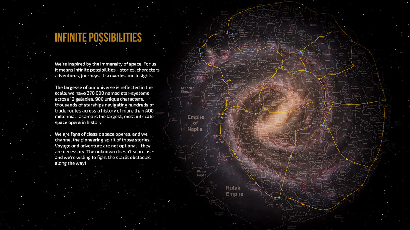
Takamo Universe galaxy map showing 270,000 named star systems across 12 galaxies. Website design and brand identity by MVOG Studio.


Takamo Universe is more than a brand. It is a living, breathing multiverse where stories connect and evolve. A rich mix of themes, character types and perspectives by curating Takamo’s stories from a diverse community of authors of various religious, philosophical, and cultural backgrounds from all over the world.Through a meticulously crafted identity, we captured its essence, enabling it to transcend its origins and invite new generations of dreamers and creators to explore its infinite possibilities. The Takamo rebranding project is a reminder that with the right vision and design, even the most intricate stories can find their perfect expression.

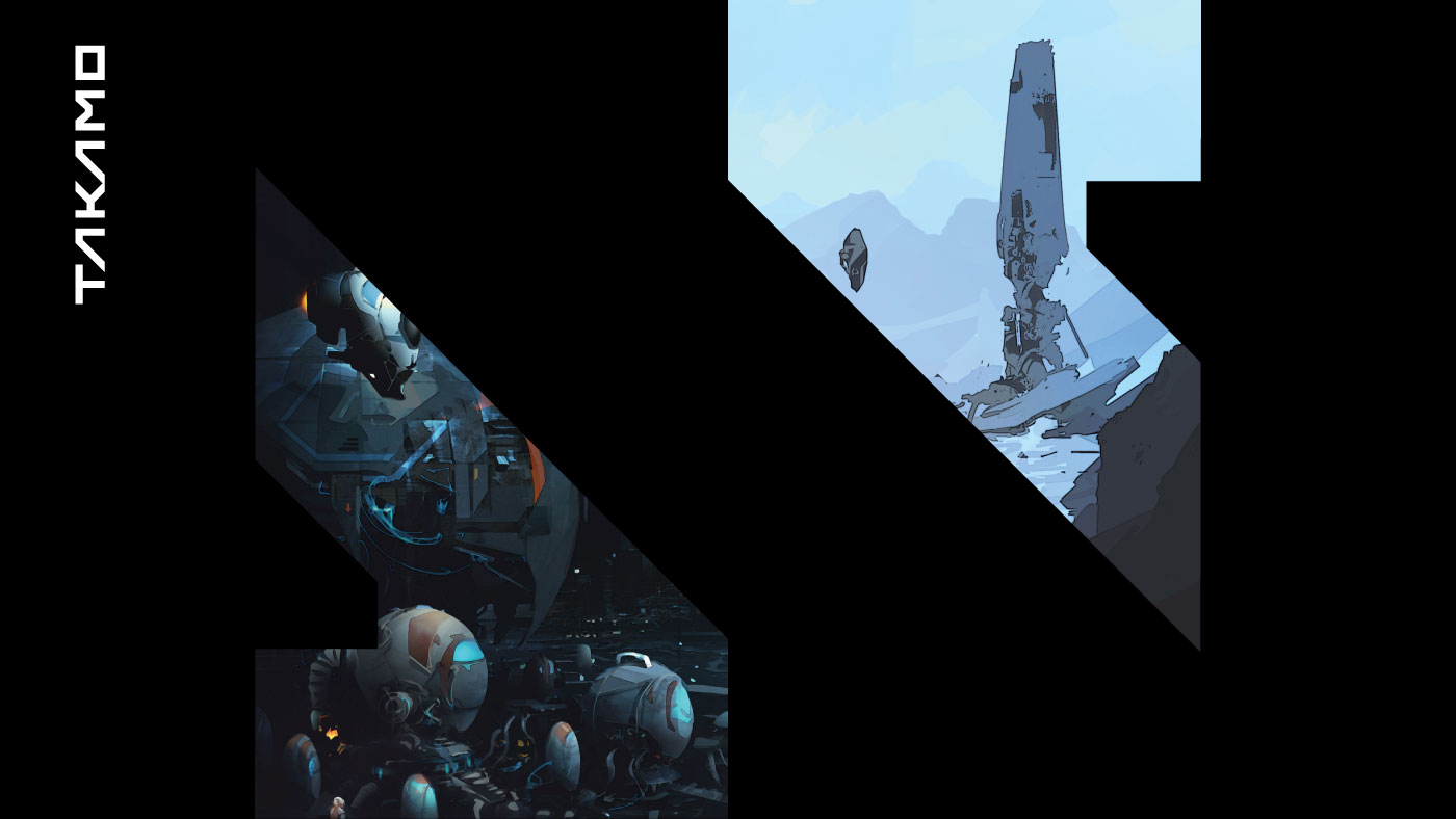
Takamo Universe orbital space station above a planet atmosphere. Cinematic brand visual from the science fiction identity system by MVOG Studio.
Takamo Universe logo A letter shape used as brand layout device across science fiction environment visuals. Brand identity system by MVOG Studio.
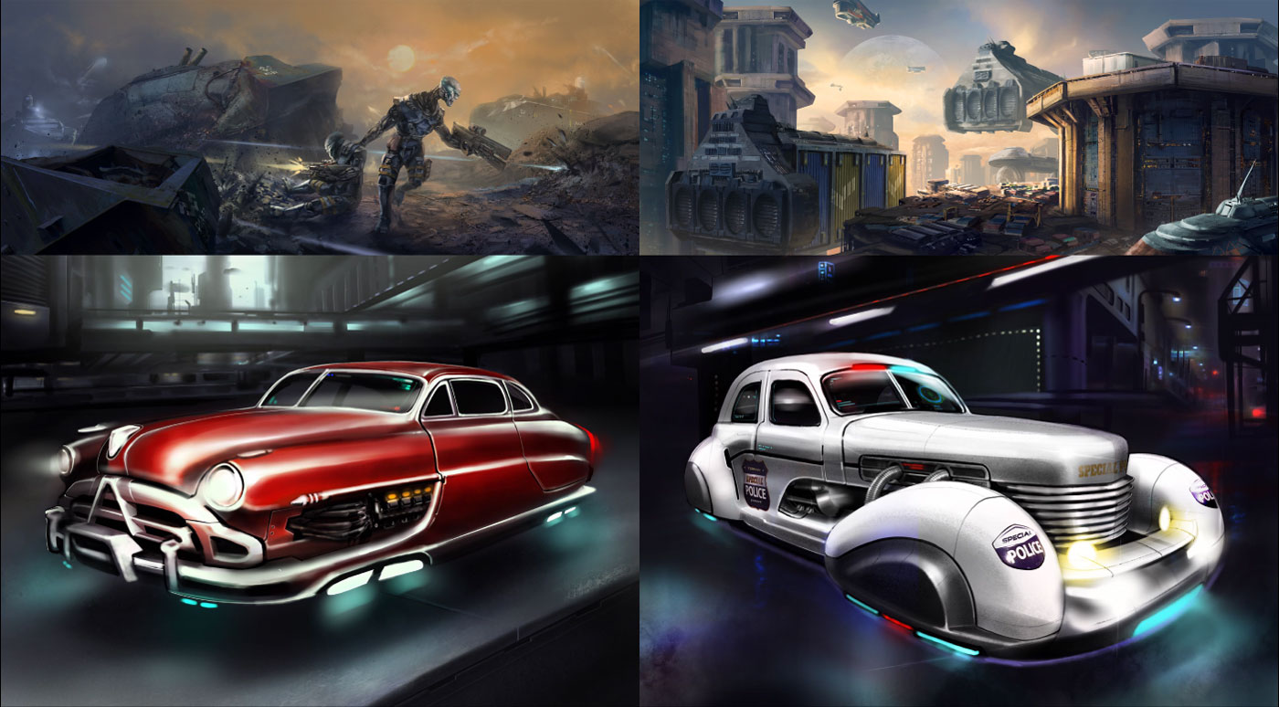
Takamo Universe world building visuals. Retro futuristic vehicles, combat characters and sci-fi city environments developed as part of the brand identity system by MVOG Studio.
Takamo Universe 3D faction spacecraft models. Four distinct ship designs each representing a different faction within the science fiction brand identity system by MVOG Studio.
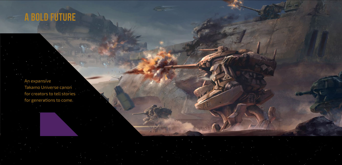
Takamo Universe Bold Future website section. Epic combat scene with mechs and spacecraft showcasing the scale of the science fiction universe. Website design by MVOG Studio.
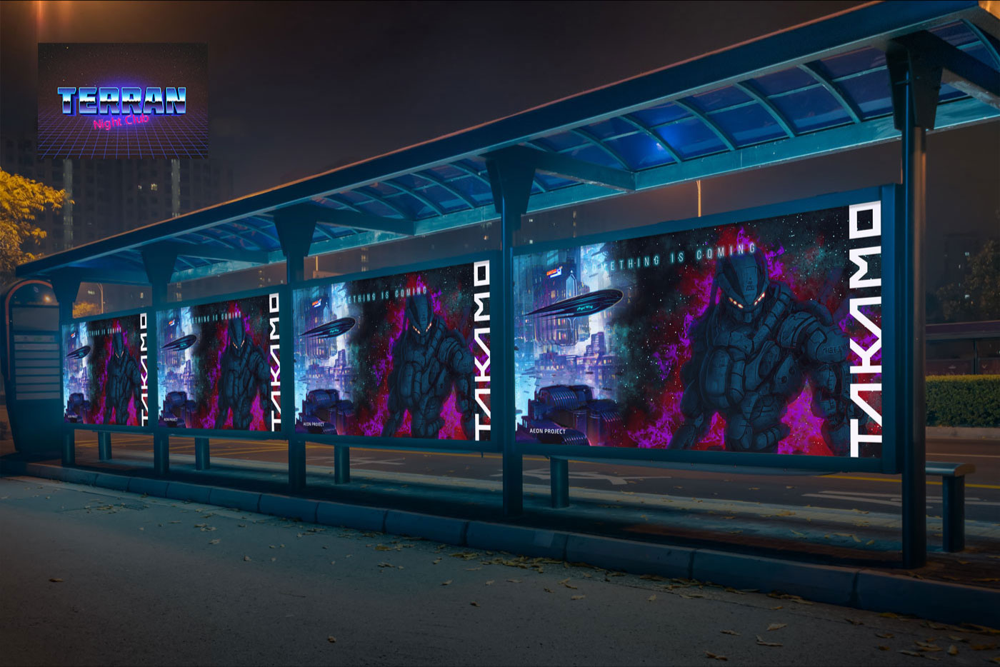
Takamo Universe Aeon Project outdoor advertising campaign. Bus shelter poster series with science fiction brand identity applied to out of home advertising by MVOG Studio.
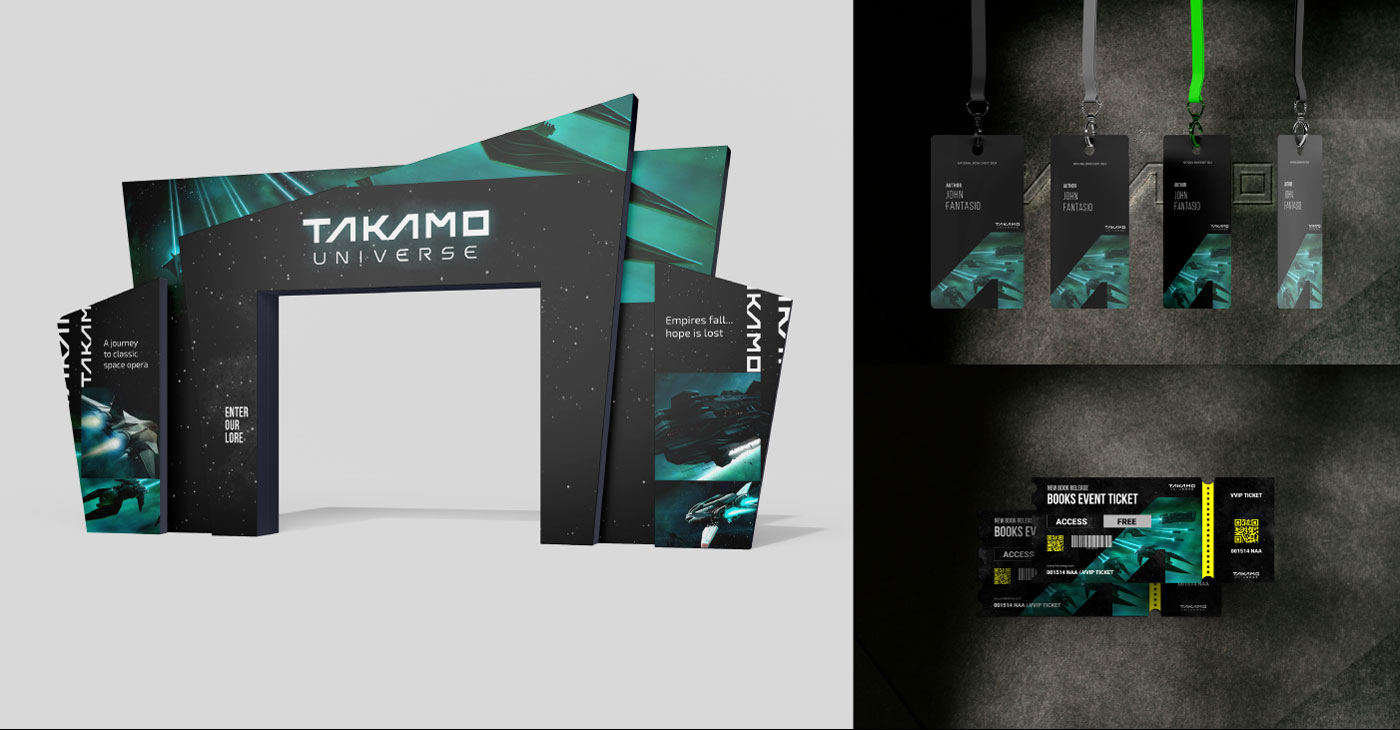
Takamo Universe event booth design, author lanyards and books event ticket design. Brand identity applied to live event materials by MVOG Studio.
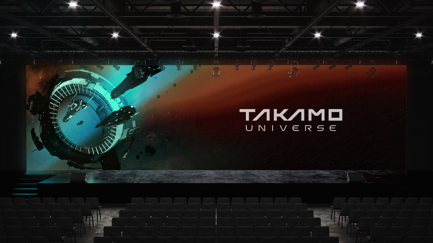
Takamo Universe brand identity on large format event stage screen. Science fiction logo and visual system applied to live event presentation by MVOG Studio.
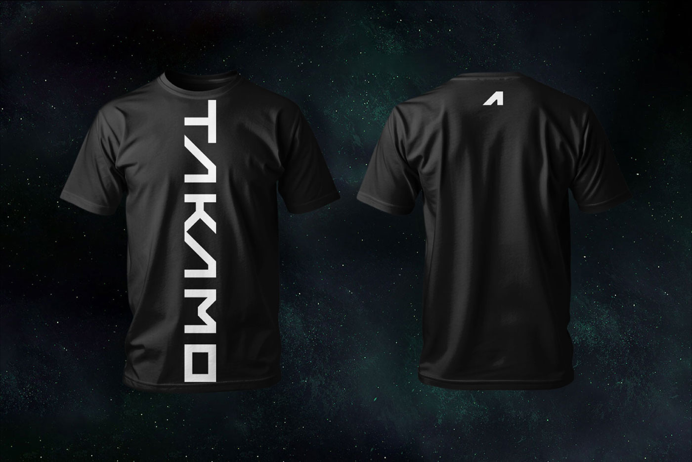
Takamo Universe branded t-shirt merchandise. Custom typography applied vertically on front with A lettermark on back. Brand identity apparel design by MVOG Studio.
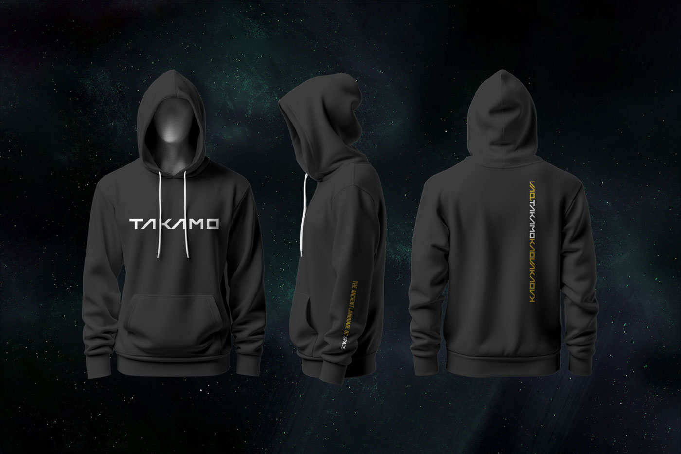
Takamo Universe branded hoodie merchandise. Front wordmark, sleeve tagline and back repeating pattern in gold. Brand identity apparel design by MVOG Studio.
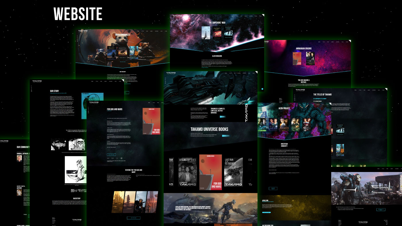
Takamo Universe full Squarespace website design overview. Multiple pages including books, community, story and titles sections designed by MVOG Studio.
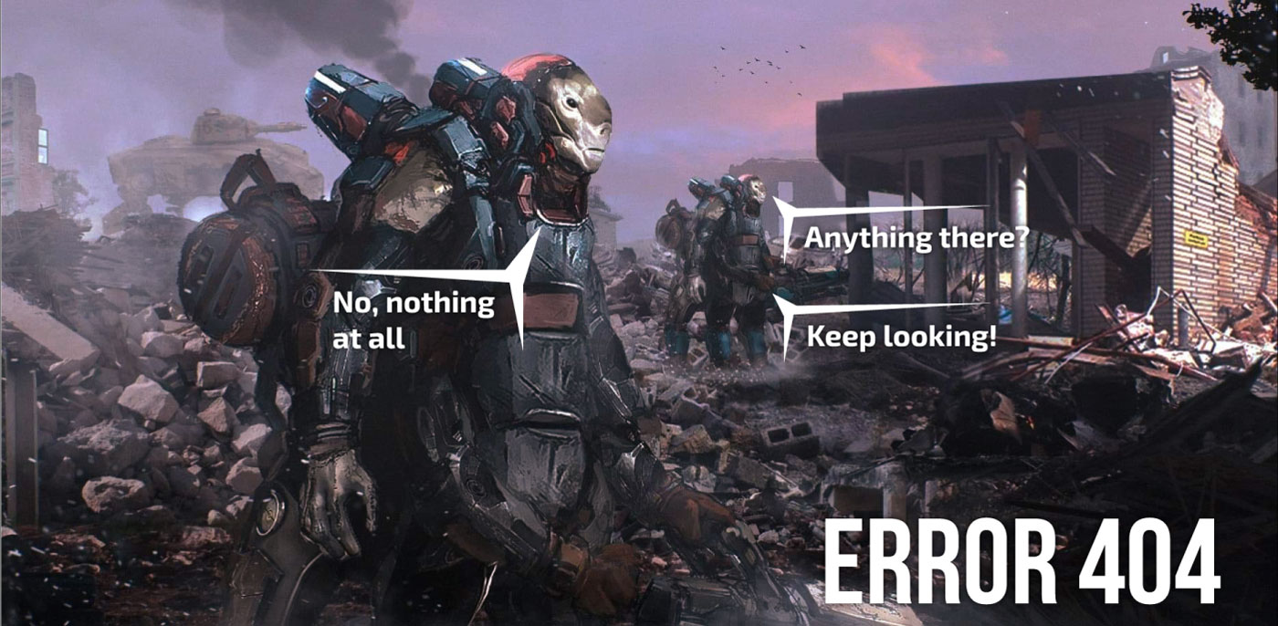
Takamo Universe custom 404 error page design. Science fiction soldiers searching through ruins with humorous brand voice by MVOG Studio.
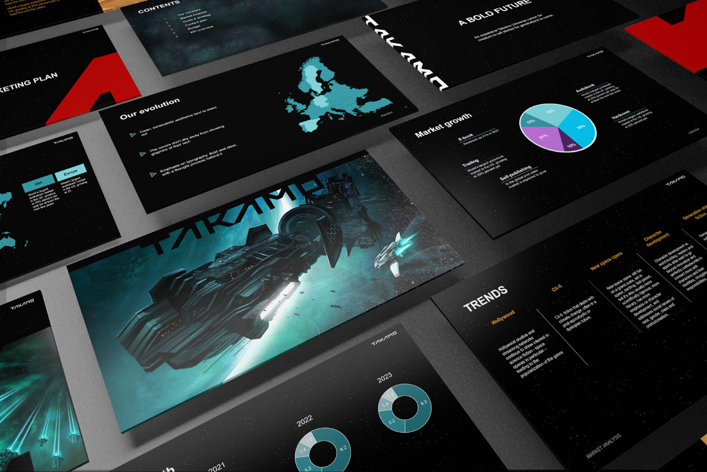
Takamo Universe PowerPoint presentation design. Marketing plan, market analysis, trends and KPI slides built within the science fiction brand identity by MVOG Studio.
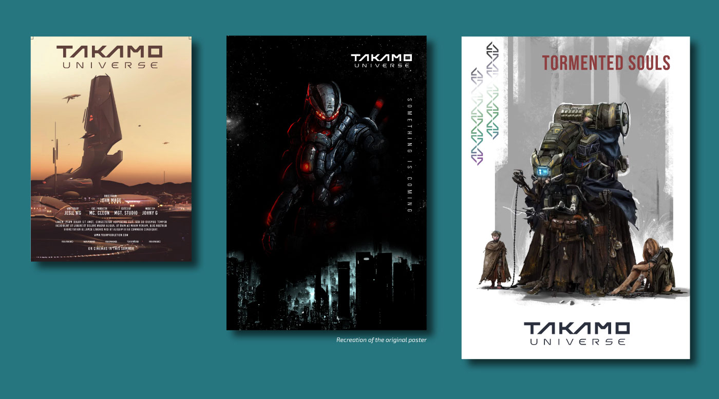
Takamo Universe poster design series. Film style poster, Something Is Coming campaign poster and Tormented Souls book cover poster by MVOG Studio.
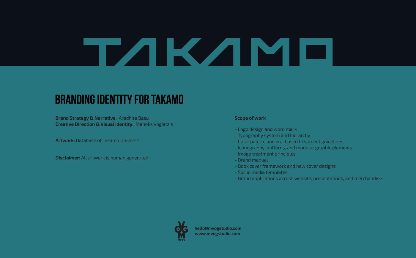
Takamo Universe brand identity project scope and credits. Creative Direction and Visual Identity by Manolis Vogiatzis. Brand Strategy by Aradhita Basu. MVOG Studio.
Takamo Universe custom typography thank you slide. Closing visual using the science fiction typeface system designed by MVOG Studio.
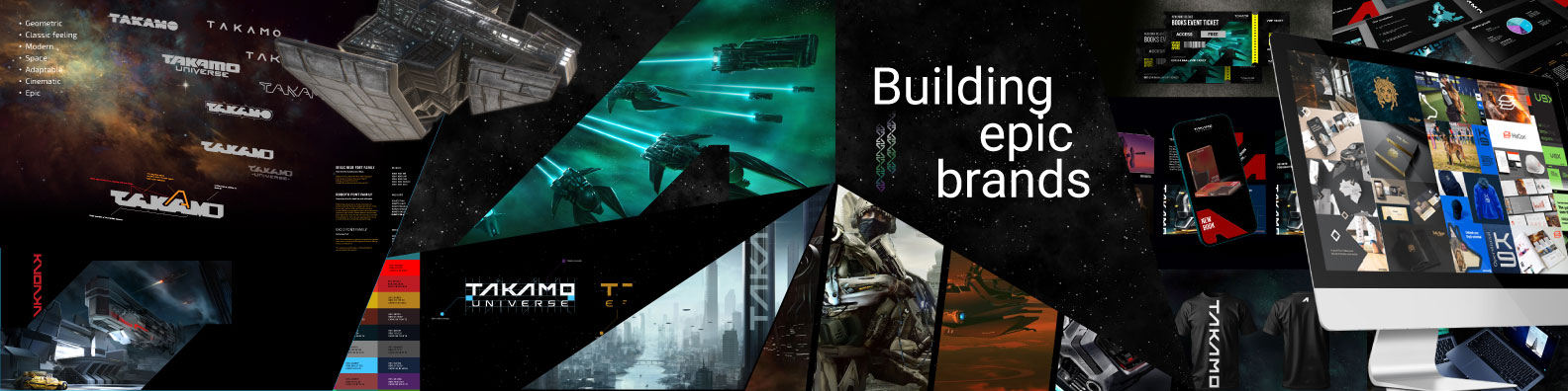
Takamo Universe complete brand identity system overview. Logo variations, colour palette, typography, merchandise, website and social media templates. Building epic brands by MVOG Studio.

Related Projects

A dynamic campaign ad for REBELS Pizza showing an ecstatic delivery driver in a yellow helmet on a scooter, next to the bold, grunge-textured black cut-wordmark logo against an orange background. Brand identity designed by MVOG Studio.
Branding, Logo
REBELS: Pizza Restaurant Brand Identity
Mockup of a jacket, created for OperationalK9 logo design project.
Logo
Operational K9 – Logo Design
johansen and sonn, a home improvement business, rebranding thumbnail
Branding
Johansen & sonn – Brand Identity

Interested in working with me on an upcoming project?

Contact me
Copyright © 2026 MVOG studio

Hit enter to search or ESC to close

MVOG Studio
  • Home
  • About
  • Projects
  • Services
  • Contact