

REBELS: Pizza Restaurant Brand Identity
REBELS | Pizza Restaurant Brand Identity
REBELS
Brand Identity for a pizza restaurant in Greece
REBELS opened in Larisa, Greece, into a market where every pizzeria was telling the same story, great taste, great ingredients, great experience. They needed a different approach to stand out.
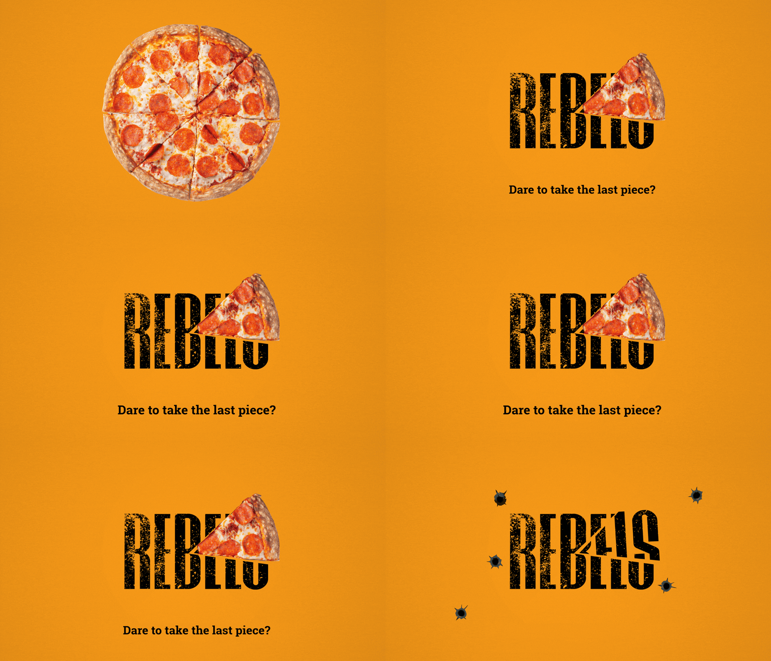
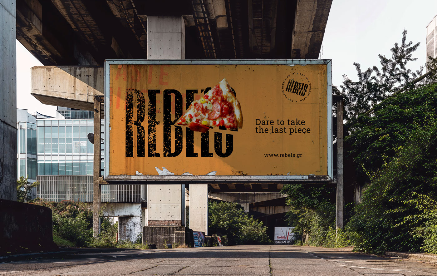
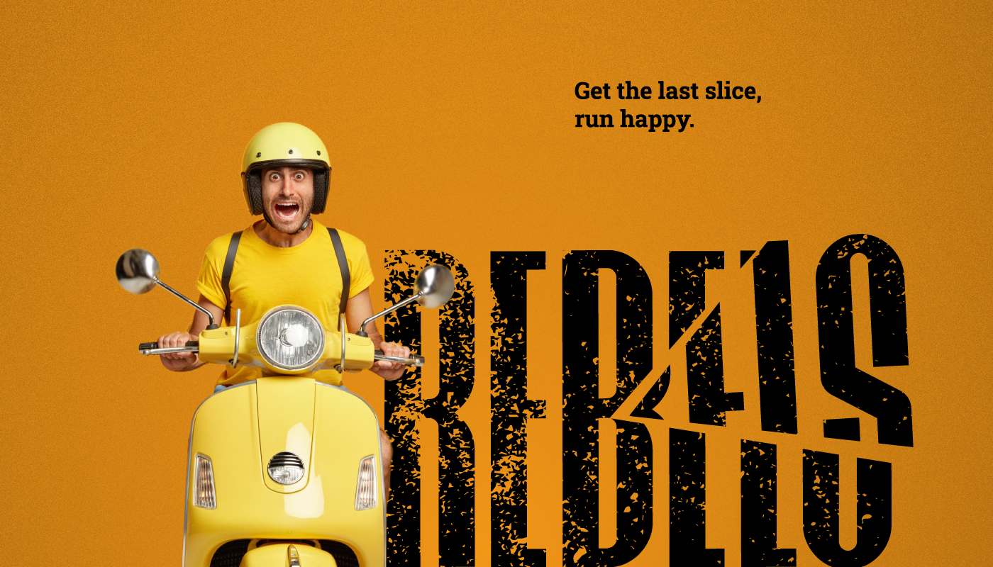
Working directly with the founders, the identity grew around one idea, rebellion for the appetite. Bold typography, a quiet dare built into the last slice nobody wants to be seen reaching for, a brand people actually want to share, not just look at. None of that matters if the pizza doesn’t back it up. So the identity had to work like a promise the kitchen could keep, not a costume the branding was wearing.
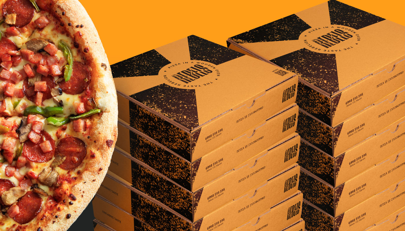
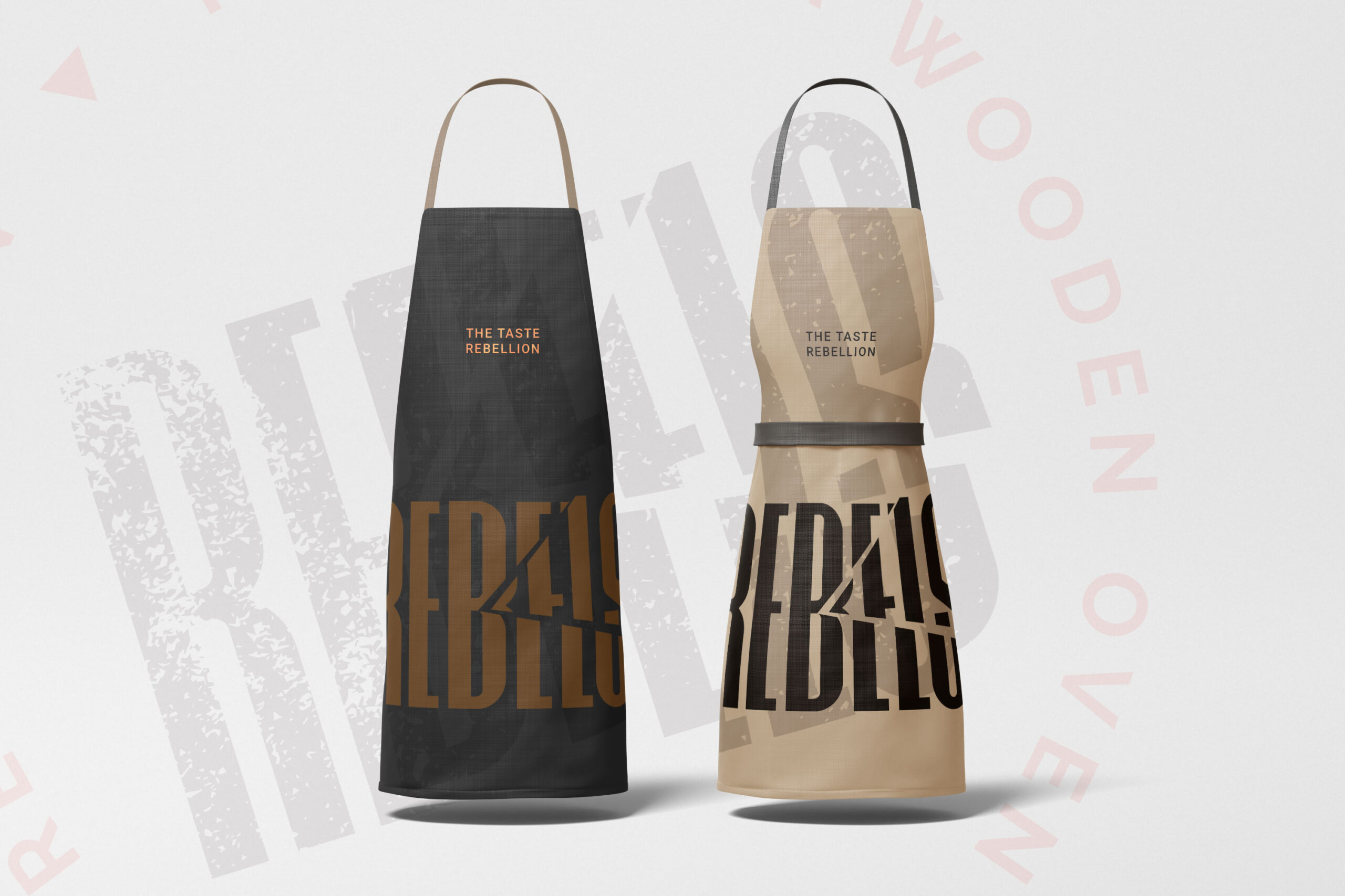
That thinking carried through from the first sketch to the last box, every piece built to hold the same idea whether it’s on a wall or in someone’s hands at their door.
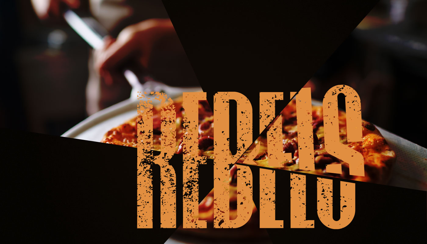
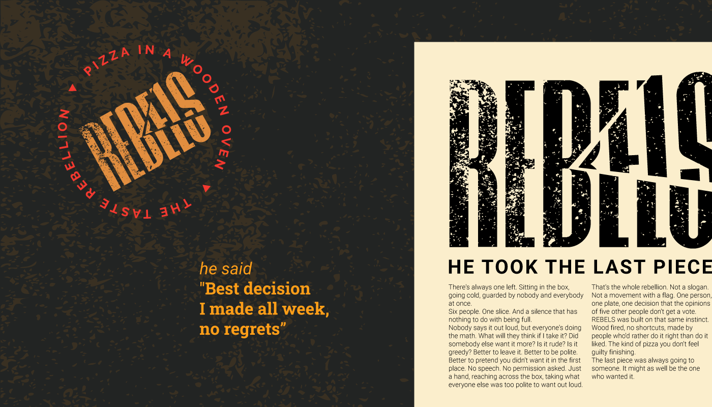
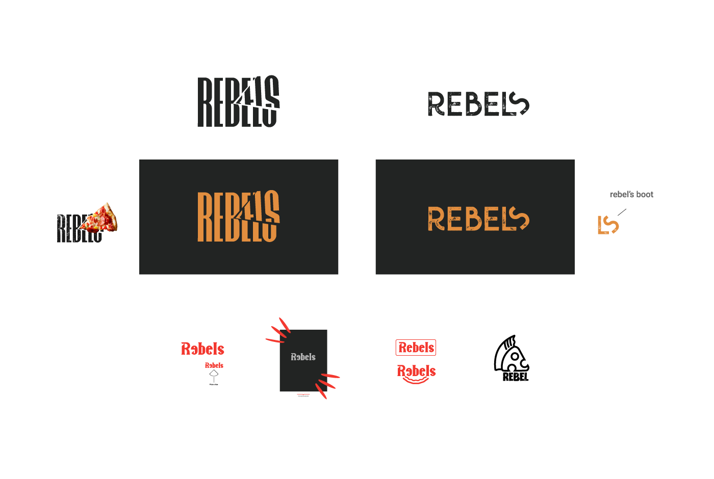
REBELS needed to hold two things that don’t usually sit together, the edge of rebellion, and the warmth people expect from a pizza brand. The typography carried that tension from the start.
Red was the obvious first instinct for a bold, provocative food brand, so that’s where the exploration started. Problem was, a deep red read closer to violence than appetite, and even lightened, it risked reading spicy on a menu where half the pizzas aren’t. Red got ruled out as a lead color pretty early, though it stayed useful, held back as an accent.
Two directions made the final round, both strong. The cut wordmark won. A piece missing from a logo keeps generating meaning wherever it shows up, long after the first look.

Related Projects